Book Jacket - other images taken
I understand on reflection that it may not look like as if I have expanded my imagination to what other images I could have used. It was just for this brief (as explained on when choosing my chosen book) I had done a process of elimination before I went out and captured my images! That is why many of these images are aimed more towards graffiti and the countryside. The images of buskers were the only two that I had taken whilst in London and seemed to kind of work. I enjoyed this brief because it was nice to get the chance to actually create a book cover with my own images. I did however find that I do need to find out more information on how to compose the rest of the detail that goes into making covers. For images revamped - no offence was intended to the original book cover images - I found it a great challenge to undertake.


Poems by a Country Lass


Book Jacket Cover
The object of this brief was to research many books and look at the covers for one that appealed to me to redesign. I have included visual examples of a few books that I have researched. Quite a few of the titles I found interesting to try to recreate but I lacked ideas when finding a suitable cover that I could recreate for them. Examples of such titles are:
· Champagne at the Murder – a small idea I had for this one was having a glass of wine, a kitchen knife and a dark background. The title reminded me of something dark from an Agatha Christie novel but it seemed too simplistic and that possibly I wasn’t thinking hard enough to try and be creative.
· Mystic River – the image I had for this cover was getting up early and going down to the river to capture the mist as it rises to give it a moody feel. However, the weather at the time was not suitable for the idea I had and time constraints did not allow me too much time to wait for suitable weather.
· Alcohol – seemed to lack any scope for creation as visually the only thing I could think about was alcohol containers and glasses. This seemed to be a bit boring and too similar to something I had done last year.
· Navigation for Walkers – the image I felt would have portrayed more of the picturesque countryside rather than the focus on being a walkers’ guide. This could have been a problem for me to interpret.
Canola and Rapeseed
I got the idea for this book cover when driving home one evening. I had stopped at the traffic lights and this vibrant yellow field in front of me caught my attention. The blue sky accentuated the beauty of nature. I was previously led to believe that this yellow field was something to do with mustard. On further research, I had educated myself to the real name of this typical spring image. When I had looked at books with the rapeseed on them, it became obvious that I would be replicating the cover of these existing books so I decided to isolate the image and concentrate solely on the flower and colour, rather than including the sky with it. Here are a few versions of the book cover I made. The original book is also included.
I have experimented with the positioning of the banner, various sizes of banner and some without one. I selected my chosen image from many that I had taken on the day. Some I took of the whole field, some were of the plant from above and some included the sky. All these I evaluated before adding them to the image seen here


AA Book of Britain’s Countryside
I wanted to use this image as, to a certain extent, it felt like a familiar British scene of the countryside to me. It gives a sense of uplifting spirits and beauty, as well as warm, summer colours. I want the public to be intrigued enough to want to pick up the book and view further and I think I achieved this with my chosen image. It would have been hard for me to have taken images of wildlife to use for the cover. I have also slightly altered the title by adding in the words “A” or “The”, mainly because it seemed to read a little easier to my mind and slightly made the “AA” unnecessary when read as a title.

The Country Diaries
I came back to this image because I felt it could be used for this title also. Looking at the original cover, I felt it tied in with the feel of imagining somebody living with inspirational scenery such as this. However, I am aware that for many of the book covers I did use the same image and on reflection I possibly limited myself too much. I do quite like this image and especially as at the time of working on this task the weather was not playing ball! I know that for next year’s tasks I MUST be more flexible.


The Birth of Graffiti
I was fortunate enough to go to London and while I was there I came across this amazing open space which was an area dedicated towards graffiti, skateboarding and mountain bikes. I thought it was a good idea to have space for such activities. Initially, I thought the image of the young woman was an advertisement poster, but on closer inspection was astounded to find it was actual graffiti. Due to the impact the image had on me, I found the original book shown and thought it would be an appropriate title to use. Although both images look identical, there’s a small difference – one image just has the black band, while the other one has a hint of white before it to make it look as if it has more depth.
I am aware that to some degree the image is sexist but the image fits well with the title of the book. A bit like my take on The Birth of Venus by Botticelli – or certainly the way I have put it together with the title of the book links into the famous painting.


Poems by a Country Lass
I wanted to use this image because I was drawn to the idea of using the tree branch to isolate the title of the book. I have used this image again due to the typical unpredictable British weather and timescale of the task. I was a little anxious as to whether I could create a sunny countryside scene. On closer inspection, I started to see the error of my judgement – the title didn’t seem to lie with the image I had in my mind. I initially found it hard with the whiteness of the clouds and the white in the typography I had used. I did want to go back and create another cover for this book using the same image, but ran out of time.

Ode to the Countryside
Although this is the same image that I have used in other book covers, here I feel that it is a more fitting image than the original book cover. The original looked to be more about woodland. I love the blue sky, almost to the degree of borderline obsession and it is what I wanted to portray.
I initially put more emphasis on the word “Countryside” because I thought that was of more importance. I used smaller, solid colour for the subtitle but it was brought to my attention that I shouldn’t mix type and that the positioning (that I thought looked good) - I didn’t realise that the layout of type is just as important as the background image choice! When I go to a book shop and look at book covers I see the pictorial image and not necessarily the words and typology. This seems to be the way my brain processes what I see as always the image is more to the fore than any writing.

Busker’s Companion
My first image – whilst in London I came across this very unusual busker who I liked because he looked typical British with his bowler hat, his old radio and white scarf. I hadn’t initially noticed the flame coming from the top of the tuba. I felt quite limited when I made this into a book cover due to having no other option but to put the title on the purple band to cover up an area of whiteness in the cluttered background. The other limitation I felt I had was the way I actually took the photo; I didn’t have composition in mind of adapting the image into a book cover at the time.
I was in London and this was another busker I came across. I decided to do the book title in red in order to complement the lining of the busker’s instrument case. I didn’t know how much of the original cover’s detail I had to include, so I included all of it. I felt there was too much background so I didn’t want to crop the image; that was when I incorporated the colour grey so as not to draw too much attention to the band deflecting away from the busker. So, I placed the name of the person who arranged the book onto the banner. I initially didn’t realise that the two topographies I used were totally opposite to one another – the title of the book was all in upper-case and the others mixed.


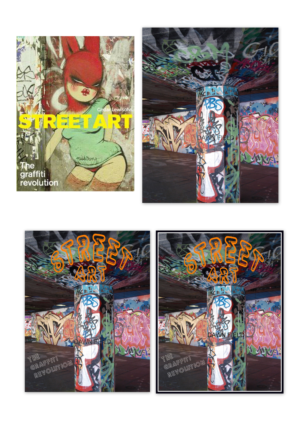
Street Art
This is my chosen image – some reasons for this are:
· I thought the “neon lights” typography worked well with the theme
· I think that the differing angles of the lines in the background help to give a sense of “depth” to the image
· I like the grey base because it’s a good contrast to the very colourful art
· I was impressed by what appears to me to be something very new in the urban environment (that is new to me)
· The white and black border to my picture I feel, draws your eye into the centre of the picture and gives an almost 3D effect
· However, the subtitle in grey at first worked well, but on reflection I can see that it would have been better if I could have lined it up with the existing lines in the photo somehow. I didn’t see this straight away. Despite this I still think it works as a book cover image.


No comments:
Post a Comment