Castle Galleries
Keith Proctor

I liked this artists work and these two images in particular. The colours in the paintings encourage the onlooker to feel happy - mainly because they were bright and vibrant and could easily take you make to your childhood memories. The images of children are really about the children exploring their surroundings for the first time and making their own memories!

Alexander Miller

I liked Alexander's work because they are also taking you back to a time of childhood, especially the above as it reminded me of free times in the company of those who the Welsh refer to as Nain and Taid! The picture below reminds me of Grandad coming home from his shift at the mine.

"Clocking on, Clocking off"
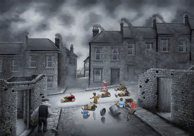
Bob Barker

"Chips and gravy"
I really like the titles of these two pieces of work! I went to this gallery specifically to view his work as it had been a while since I first came across him in Rennie's Gallery in Liverpool. His works are favourites of mine and each one has it's own nostalgic link to things remembered.

"Early bath"
Craig Davison

"Fist full of quavers"
I was drawn to these images because of the artist's particular style of working. This may be because he works as a comic illustrator and the people in these pieces look a little bit like cartoon characters. The images above and below do not have a background as such and this draws your eye to the foreground subject.

"Turtle power"
Neil Dawson

I liked the use of the lights in the above painting as it enhances the feeling that you are looking through a window out at a rainy evening's traffic, and although it appears as a dark, miserable evening the resulting image is a pleasant one.
Paul Kenton


"Electric city"
I caught myself studying this artist's work for some time. Something about the way he had applied the paint in a strange way reminded me of cake painting. This is because some of the colours look as if they have been "drizzled" onto the canvas, straight from the tube.
The Watergate St Gallery
Alberto Martinez

"The Good old days"
This painting I really liked because of the very vibrant colours used. I found myself discovering more things in the painting, the more I looked at it! I found my eye wandering down the street to what else I could find. Although it seems a bit of a mish-mash of a painting, I think it worked very well.
Allan Morgan

Images of the work by this artist do not truly do them justice. To truly appreciate them you would need to be standing right in front of them. They were quite tranquil in their atmosphere and reminded me of a leisurely walk through the fields.
David Wild

The work above is obviously of an industrial landscape and almost appear quite futuristic. The link of the bridges into or under each other encourages you to study the whole painting. The use of green, purple and orange in particular, caught my eye as they help to make the subject more "alive".

I am not sure how this image has been executed, but the result has an almost "cushioned" effect and is bright, vibrant and suits the subject content. It is quite obvious that it is based around "Alice in Wonderland".
Mamazbek Chekirov

"New York"
I liked all the taxis! What can I say - it is how everyone thinks the New York streets look.
I liked all the taxis! What can I say - it is how everyone thinks the New York streets look.
Mary Shaw

The above work is another of those that are not really impressive unless you are actually in front of it. It gives that dreamy effect of a hot Summer's day. You can actually buy them in the form of a circular painting, which I thought was unusual.
Sarah Jane Szikora

This work made me smile. It almost made me think of a secret world - the Life of Sweets!!
Leigh Lambert

"Hooray for Harry's"
The work of this artist appears very similar to the work of Bob Barker - but although it includes industrial backgrounds and the images of children in the streets it appears "cartoon - like" in comparison to Bob's work.
The Arc Contemporary Crafts
Ian Mitchell

I like this artist's work because it is quite uncluttered in it's content. It appears to me to be echoing the style of Art Deco, Clarice Cliff and the like.

Also visited
No comments:
Post a Comment