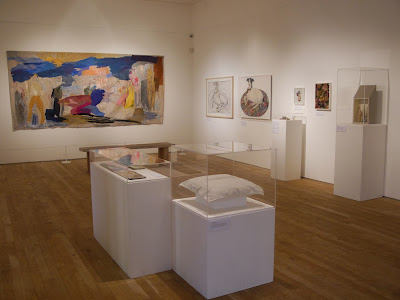
I had come gone to see this exhibition as part of my M.A research. It was a good opportunity to go and see this, due to the fact that it was mostly textiles and I have not seen much of this kind of work to date and also I like to see what new ideas artists come up with.
Audrey Walker
The above work I found very life-like and at first I thought it was a photograph. The detailing is evidence of hours of work. I presume that the artist worked from a photograph or a sketch as some of her other work in this exhibition shows that they had been constructed using this method. The red in the flowers drew my eye into the piece and the further I examined it the more I could see the different stitches that she had used. It illustrates how an embroiderer can create work that looks 3D.
First of all it was the colours used on the covering that drew my eye. Secondly I noticed the night time window that emphasised the fact that this was supposed to be a view of subjects at night. Overall, the colours of the piece are darker to enhance the effect of this view - I have not often seen this subject portrayed. On further research, I can detect definite links to the work of Klimpt - especially his piece entitled "The Kiss".
Cleo Mussi
The image above reminds me of the character in the film "Donnie Darko" and the quote below has been taken from the website referenced. After reading this article it makes my initial thoughts about the link to Donnie more believable.
"Genetic scientists and their mutant creations are depicted in Cleo Mussi's colourful ceramic mosaics."
http://www.telegraph.co.uk/property/interiorsandshopping/10017942/A-world-in-pieces-the-ceramic-mosaics-of-Cleo-Mussi.html
Jane McKeating
I really liked the images used on two belts in particular. The first one was linked to my own passion for taking photos of red telephone boxes. It illustrated different aspects of the boxes: inside, outside, complete views of and close ups of specific parts such as the dial.
The bottom belt in the above photo links to my theme of "Nostalgia". Images of old Bakelite phones and even the play phone that I had as a child feature in this work. The images have been digitally printed onto fabric and then the artist has stitched onto them using hand and machine stitching. I think it's an original idea and it seems almost as if any themed image could be done in this way to cater for everyone's taste. It would be a way of people wearing hip, trendy artwork and I think they are vibrant, non-repetitive and easy to distinguish one image from the others.
Mary Cozens - Walker
Diana Thorton
Eirian Short
Denys Short
I have viewed the above method of working many years ago on a children's art programme. This appealed to me then. It is a way of having two images in one piece and it makes the viewer work to see both. I like how the position of placement for the work needs to be incorporated in it's hanging and it makes me want to explore further into creating something within my own practice.
Michael Brennand - Wood
Nicola Henley
Kim Bentley
Christine Mills
Suet Yi
Emilie Taylor
I was really taken with this artist's work. The images seem to be of today's environment and they incorporate the traditional shape together with the surface decoration that is very modern. Due to viewing the work, I am studying it in further detail within my own artist's practice.
The items below were in the gallery shop.
Linda Miller
Lowri Davies
Paul Preston
Alison Duper
Dail Behennah


No comments:
Post a Comment